Brand Guidelines
Resources & guidelines for correct usage of the GiveForms brand, provided for press, partners, and integration documentation.
Naming
Our name, spelled correctly
GiveForms is always written as one word with a capital G and a capital F. When referring to the company in formal or legal contexts, use GiveForms, Inc. In product and marketing contexts, GiveForms is sufficient.
Logo
The GiveForms logo
Is a wordmark paired with our icon mark. Together they form a compact, legible symbol that works across digital and print contexts.
Two official variants are available: horizontal and vertical. Use the horizontal variant as the default. Use the vertical variant when a square or stacked format is needed — such as app icons, social avatars, or constrained layouts. Do not recreate, trace, or approximate the logo.
Clear Space
Always maintain clear space around the logo equal to the height of the "G" in GiveForms on all sides. Never allow other elements to crowd the logo.
Minimum Size
The horizontal logo should never appear smaller than 150px wide in digital contexts or 1” wide in print. The vertical logo should never appear smaller than 100px wide in digital or 0.75” in print.
Logo Usage
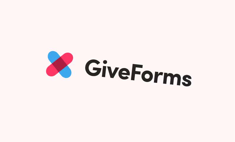
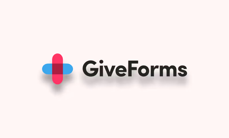
How not to use our logo
Maintaining logo integrity builds trust with the nonprofits and donors who rely on us.
Colors
The GiveForms Brand colors
Our palette is built around a high-contrast blue that signals trust, precision, and performance — qualities that define how we approach donation infrastructure. The accent colors are used sparingly to draw attention to key moments in the product and marketing.
RGB 3, 101, 233
CMYK 99, 57, 0, 9
RGB 255, 53, 101
CMYK 0, 79, 60, 0
RGB 172, 30, 64
CMYK 0, 83, 63, 33
RGB 36, 36, 36
CMYK 0, 0, 0, 86
Usage policy
How you may use our brand
See where your donation form is losing gifts
Bring your current form to a demo and we'll compare it to GiveForms. Migration and onboarding are included if you switch.